Krita comes to Discworld!
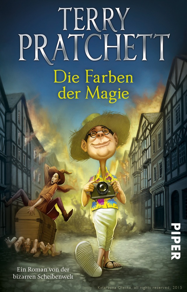
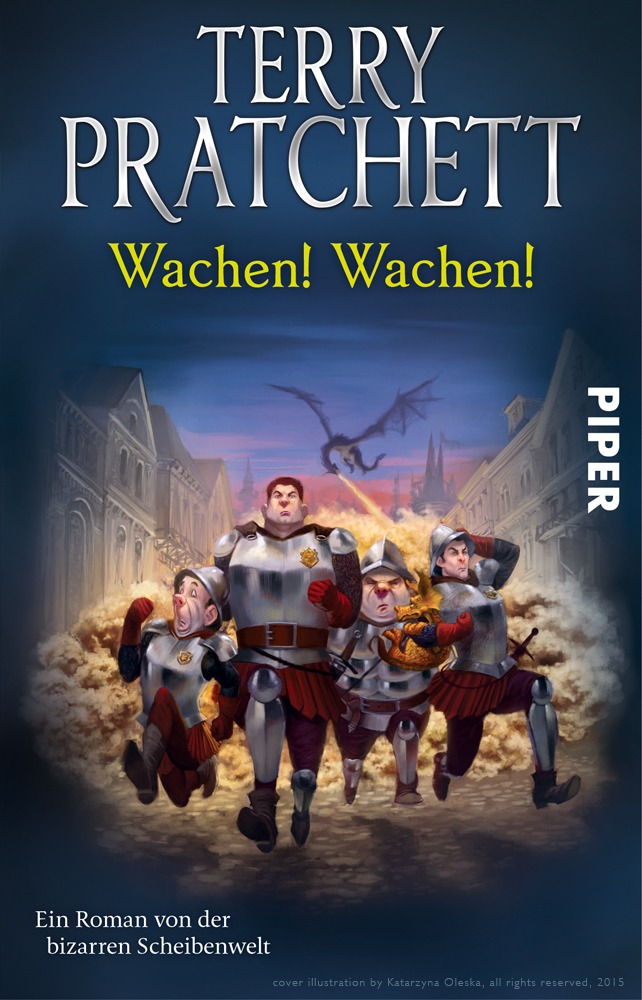
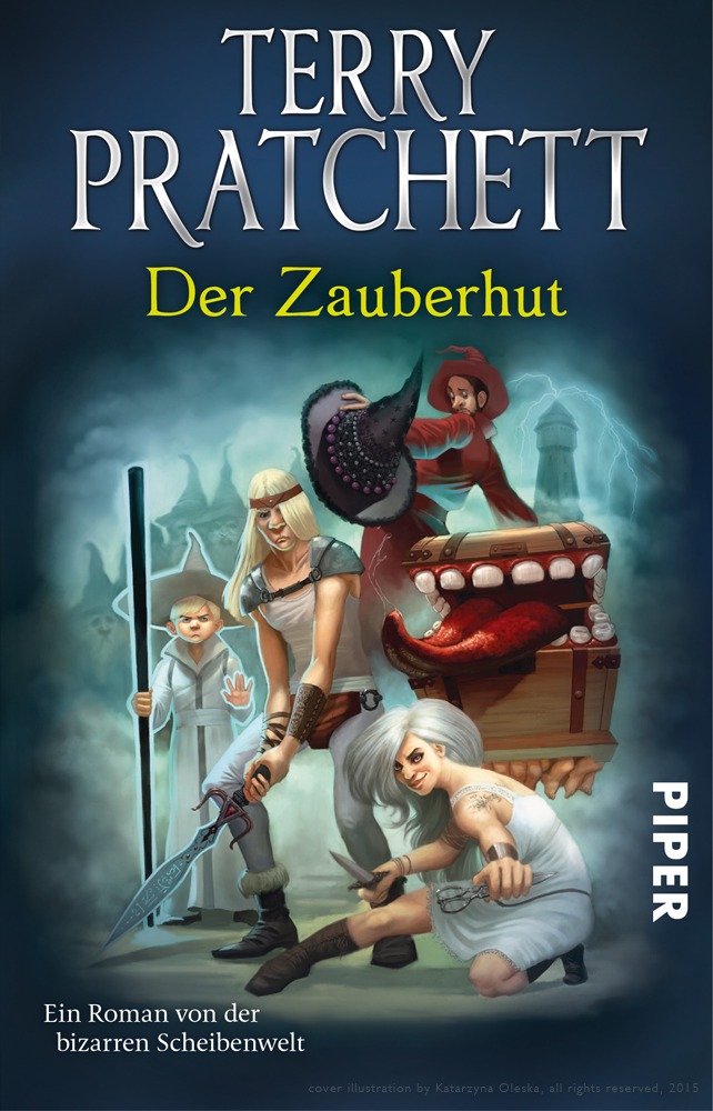
We found out that the German Discworld covers were made with Krita, and had the privilege to ask the artist to talk about her work!
(Don't forget to check out our 2015 Kickstarter campaign as well!) 
Hi. My name is Katarzyna Oleska and I am an Illustrator working for publishers, magazines and private clients. A couple of months ago, I came across a free program for painters called Krita. My experience of free programs in the past wasn't great, but to my surprise, Krita was different. At first I was overwhelmed with the number of dockers and settings, but soon found that they were there for a reason. I fell in love with Krita so much that I left my old Corel Painter and started using Krita to paint my commissions. Most of my recent Terry Pratchett covers were painted in Krita.
How did you get into illustration/book cover painting in the first place?
I started painting covers back in 2003 when I was still studying architecture. I'd always liked to draw and paint and wanted to see my works in print. So one day I took a chance and e-mailed one of the publishers I wanted to work for. I attached a couple of samples of my works and I got my first job straight away. Pretty lucky. Back then I was still working traditionally but as time went by I bought a tablet and started working digitally.
How do you find jobs?
It really depends. Some of the commissions come to me and some I have to chase. If the commission comes to me it's usually through word of mouth or because the client saw my works online. But I also approach new publishers, send them my work samples, my portfolio etcetera.
Can you choose which books you illustrate, or do you just do what a publisher throws you?
Unfortunately I don't have the comfort of choosing what I want to illustrate. I can refuse politely if I think I can't deliver a good illustration, for example when I feel my style wouldn't fit the story. But publishers usually know what I am good at, they know my portfolio and I have never really refused any cover yet.
How do you determine which scene/character(s) to put on the cover?
The best decision of which scene or characters to put on the cover can only be made if I know the story so whenever I have a chance to read a book I take it. Being a fan of reading myself, I know how important it is for the cover to reflect the story inside; especially with a series like the Terry Pratchett Discworld novels. I was already a huge Terry Pratchett fan, so that wasn't a problem.
When choosing a scene to paint I usually try to analyse where the main focus of the story is. Very often I am tempted to paint a scene that would look amazing on the cover but I catch myself in time and remind myself that this particular scene, though amazing, wouldn't really sell the story. So I choose the one that will do it better and will also resonate with the title. For example with "Guards, Guards" the only reasonable choice was to paint the Guards running away from a dragon they were trying to track down. Nothing else would really fit.
Sometimes, however, it's impossible to read a book because of a tight deadline or the language it was written in. When that happens I try to make sure I find out as much as possible about the book from the publisher.
What sets Krita apart from other tools you've used?
The first and most obvious thing is that it's free. I love than young artists will now have access to such a great tool without spending lots of money. But I would never recommend a program based solely on the price. I have used some free programs and never liked them. They would last a very short time on my computer. With Krita it's different - I think it's already a strong competitor to the best known programs on the market.
For me, Krita feels very natural to use. I have worked both in Photoshop and Painter before and although I like them, I've always been hoping to find a program that sits somewhere in between those two. As an illustrator I am mostly interested in paint tools. Photoshop has always seemed too technical and not so intuitive. Painter, while trying to deliver the painterly feel, wasn't really delivering it. With Krita I feel almost like I'm painting. The number of settings for brushes can be overwhelming at first, but it helps to create brushes that are customized specifically for me. I especially like how Krita manages patterns in brushes.
What does Krita already do better, and what could make it better still?
As well as the brushes, I also love the vector tools in Krita. I have never before seen a program where tools would change their characteristics depending on what kind of layer we use them on (paint/vector).
I also love that I can pick a color with ctrl and dynamically change the size of the brush by holding shift and dragging my pen. I often only have to use my pinky to control these two.
Rotating the canvas is easy (space-shift) and I am addicted to the mirror tool as I use it to verify the proportions in my paintings (mirroring the image helps spot mistakes). I love that when I'm using two windows for one file the mirror tool only affects one of the windows. The warping tool is also great. I don't use it much, but I tried it out and I love the way it works. Multiple Brushes and Wrap Around Mode are great too, they make creating patterns so easy. But one of my favourite things is that I can choose my own Advanced Color Setting Shape and Type and that there are so many options that come with it.
Things that could be improved: when I overwrite a brush preset I cannot keep the old icon I created. Perhaps an option to keep the old icon could be added. Seems like a small problem but when using many brushes I get used to the icon and when it's gone I have to search for my brush. The other improvement would be the ability to merge multiple layers together.
Can you give a quick overview of your workflow?
Sure. I actually prepared a short video that shows how I work. It's a sketch for Terry Pratchett's "Wyrd Sisters". I used the older version of Krita back then but the workflow remains the same.
Do you work closely with the publisher for a book cover, or do you only deliver a painting so you don't see the result until it's published?
Very often, before I even start sketching, the publisher will send me a draft of the cover's layout so that I am aware of how much space I have to work with. Sometimes however, when the publisher doesn't know the final layout, they give me some directions and let me decide how much space I want to leave for the lettering. Usually after I've handed them the initial sketch they can correct me, and ask to change the composition a bit. When it comes to the finished illustration I have full control over it until I've e-mailed it to the publisher. Once they have approved it, how it looks when it is published is out of my hands. Sometimes they will send me the final version of the cover, so that I know what it will look like in print and I can make some last minute suggestions but I don't have real control over the cover itself.
What are the special requirements (colour, resolution, file format) and challenges when you work for print?
I like to work with bigger formats. I think a painting looks better when painted big and then shrunk to the size of the cover rather than when it's painted with only small size in mind. A big size forces me to be more precise in details so in the end the image looks more crisp and the quality is better. Besides, the client may in the future want to use the painting for a poster and then I know the painting will look great.
I usually work with psd files. I use many layers and this is the best file type for me. When I send out the final image I flatten the image and save it as a tiff file. It may be heavier than jpg but there is no loss in quality. Also I work in an RGB mode but I always switch to CMYK in the end to see if I like how it's going to look in print (CMYK has fewer colors). If necessary I correct any mistakes I see.
To see more of Katarzyna's work, visit her site: www.katarzynaoleska.com
Publishing House: Piper –www.piper.de Lettering: Guter Punkt – www.guter-punkt.de


