Children's book with Krita
Today we've got a guest article by John Gholson. John is an artist who is currently working on a big project -- an illustrated children's book. As far as we know, it's the first time an artist is using krita to illustate a whole children's book project. So, over to John!
Hi! I'm John Gholson Jr -- and I am creating a children's book together with my friend Margo Candelario, a seasoned author and poet. She's doing the writing, and I'm doing the artwork! The colouring of the book is done 100% with Krita. I discovered Krita while looking for open source alternatives to the usual illustration software like Corel Painter or Photoshop. Krita was a very fun discovery -- and moreover, Krita fits the theme of our book: solutions can be right in front of you or just a few steps away. Other themes of our book are exploration and adventure!
Here's a complete overview of my workflow:
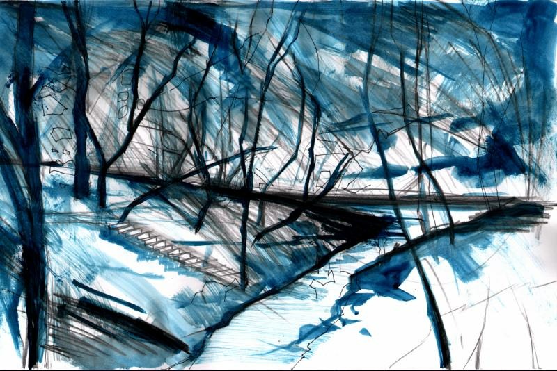
I love drawing in the traditional way first with ink washes or pencil to get some actual texture. Then I scan the image at 600dpi and go to town with Krita! There are several benefits to this combined method. It's still very hard to replicate with a tablet some things that happen with physical drawing, like the subtle incremental details that a pencil gives. Working with layers is amazing, though. It's something the early Disney animators did for their backgrounds, too.
A mostly digital workflow means a big saving in cost in art supplies or paint, so you can take more risks, you can mix colours instantly without cleaning your brush, and you don't get awkward muddy colours like with oil or acrylic paint!
The difference in workflow isn't good or bad in itself, it's just a very big difference. I find it a lot faster and more efficient in Krita than in traditional media to work from dark to light. In fact that's often what I do: use a dark and a light colour, swap foreground and background, and darken or lighten those two colours with 'k' and 'l' to get a whole range. I love the way the Krita interface works: not only the 'k' and 'l' keys for darker and lighter, but also the custom brushes, the speed and the reliability of the software. And the ability to define my own shortcuts!
But it's combining Krita with traditional art that's stolen my heart. Here's my personal artwork: http://www.JohnGholson.com, and here's my bio: http://john-gholson.artistwebsites.com/index.html?tab=about.
And check out our book project: http://www.book.gqbum.com!
